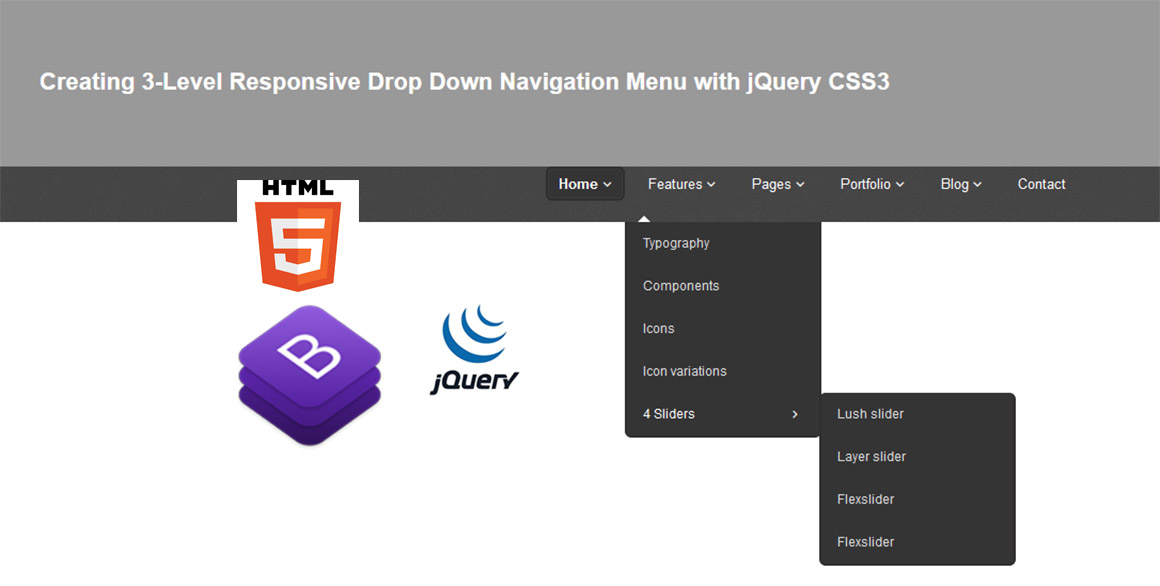
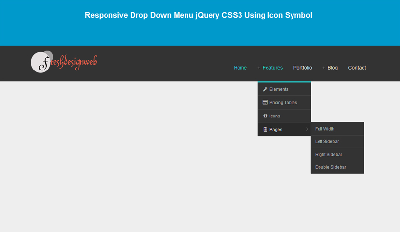
A Beautiful 3-Level Responsive Drop Down Navigation Menu with jQuery CSS3 where sub-menu will either appear above or below the main menu with narrow symbol. With my previous tutorial, i also show how to create drop down responsive menu with CSS3 and jQuery as well.

This is a simple responsive dropdown menu that will show a submenu in 3 level with narrow symbol, we use narrow symbol with open fonts symbol that it is perfect fonts images when hovering over an item. The submenu will either appear above or below the main menu, depending on where more space is available. Using the effect on menu will either react on hover or on click. Example media queries will show adjust responsive on screens size of computer or smartphone.
This Responsive Drop Down Navigation Menu using plugin such as:
The Markup Language
The HTML :
<header>
		<div class="container">
				<div class="navbar navbar-static-top">
					<div class="navigation">
						<nav>
						<ul class="nav topnav bold">
							<li class="dropdown active">
							<a href="https://www.freshdesignweb.com/3-level-responsive-drop-down-navigation-menu-jquery-css3.html">Home <i class="icon-angle-down"></i></a>
							<ul class="dropdown-menu bold">
								<li><a href="https://www.freshdesignweb.com/3-level-responsive-drop-down-navigation-menu-jquery-css3.html">Homepage 2</a></li>
								<li><a href="https://www.freshdesignweb.com/3-level-responsive-drop-down-navigation-menu-jquery-css3.html">Homepage 3</a></li>
								<li><a href="https://www.freshdesignweb.com/3-level-responsive-drop-down-navigation-menu-jquery-css3.html">Homepage 4</a></li>
							</ul>
							</li>
							<li class="dropdown">
							<a href="#">Features <i class="icon-angle-down"></i></a>
							<ul style="display: none;" class="dropdown-menu bold">
								<li><a href="https://www.freshdesignweb.com/3-level-responsive-drop-down-navigation-menu-jquery-css3.html">Typography</a></li>
								<li><a href="https://www.freshdesignweb.com/3-level-responsive-drop-down-navigation-menu-jquery-css3.html">Components</a></li>
								<li><a href="https://www.freshdesignweb.com/3-level-responsive-drop-down-navigation-menu-jquery-css3.html">Icons</a></li>
								<li><a href="https://www.freshdesignweb.com/3-level-responsive-drop-down-navigation-menu-jquery-css3.html">Icon variations</a></li>
								<li class="dropdown"><a href="#">4 Sliders <i class="icon-angle-right"></i></a>
								<ul style="display: none;" class="dropdown-menu sub-menu-level1 bold">
									<li><a href="https://www.freshdesignweb.com/3-level-responsive-drop-down-navigation-menu-jquery-css3.html">Lush slider</a></li>
									<li><a href="https://www.freshdesignweb.com/3-level-responsive-drop-down-navigation-menu-jquery-css3.html">Layer slider</a></li>
									<li><a href="https://www.freshdesignweb.com/3-level-responsive-drop-down-navigation-menu-jquery-css3.html"> Flexslider</a></li>
									<li><a href="https://www.freshdesignweb.com/3-level-responsive-drop-down-navigation-menu-jquery-css3.html">Flexslider</a></li>
								</ul>
								</li>
							</ul>
							</li>
							<li class="dropdown">
							<a href="#">Pages <i class="icon-angle-down"></i></a>
							<ul class="dropdown-menu bold">
								<li><a href="https://www.freshdesignweb.com/3-level-responsive-drop-down-navigation-menu-jquery-css3.html">About us</a></li>
								<li><a href="https://www.freshdesignweb.com/3-level-responsive-drop-down-navigation-menu-jquery-css3.html">Pricing boxes</a></li>
								<li><a href="https://www.freshdesignweb.com/3-level-responsive-drop-down-navigation-menu-jquery-css3.html">404</a></li>
							</ul>
							</li>
							<li class="dropdown">
							<a href="#">Portfolio <i class="icon-angle-down"></i></a>
							<ul style="display: none;" class="dropdown-menu bold">
								<li><a href="https://www.freshdesignweb.com/3-level-responsive-drop-down-navigation-menu-jquery-css3.html">Portfolio 2 columns</a></li>
								<li><a href="https://www.freshdesignweb.com/3-level-responsive-drop-down-navigation-menu-jquery-css3.html">Portfolio 3 columns</a></li>
								<li><a href="https://www.freshdesignweb.com/3-level-responsive-drop-down-navigation-menu-jquery-css3.html">Portfolio 4 columns</a></li>
								<li><a href="https://www.freshdesignweb.com/3-level-responsive-drop-down-navigation-menu-jquery-css3.html">Portfolio detail</a></li>
							</ul>
							</li>
							<li class="dropdown">
							<a href="#">Blog <i class="icon-angle-down"></i></a>
							<ul class="dropdown-menu bold">
								<li><a href="https://www.freshdesignweb.com/3-level-responsive-drop-down-navigation-menu-jquery-css3.html">Blog left sidebar</a></li>
								<li><a href="https://www.freshdesignweb.com/3-level-responsive-drop-down-navigation-menu-jquery-css3.html">Blog right sidebar</a></li>
								<li><a href="https://www.freshdesignweb.com/3-level-responsive-drop-down-navigation-menu-jquery-css3.html">Post left sidebar</a></li>
								<li><a href="https://www.freshdesignweb.com/3-level-responsive-drop-down-navigation-menu-jquery-css3.html">Post right sidebar</a></li>
							</ul>
							</li>
							<li>
							<a href="https://www.freshdesignweb.com/3-level-responsive-drop-down-navigation-menu-jquery-css3.html">Contact </a>
							</li>
						</ul>
						</nav>
					</div>
					<!-- end navigation -->
				</div>
			</div>
			</div>
		</div>
	</header>
The CSS
.bold {
	font-weight:900;
}

/* --- header -- */
header{
	background: url(../img/header-pattern-150.png) repeat;
	margin:0;
	padding:0 0 20px;
	position:relative;
	z-index:2000;
}

/* --- menu --- */

header .navigation {
	float:right;
}

header ul.nav li {
	border:none;
	margin:0;
}

header ul.nav li a {
	border:none;
	font-weight:400;
}
header ul.nav li ul {
	z-index:1000;
	margin-top:20px;
}
header ul.nav li ul li ul {
	margin:1px 0 0 1px;
}
header ul.nav li a i {
	color:#fff;
}
.container,
.navbar-static-top .container{
  width: 940px;
}
.container {
  margin-right: auto;
  margin-left: auto;
  *zoom: 1;
}
.container:before,
.container:after {
  display: table;
  line-height: 0;
  content: "";
}

.container:after {
  clear: both;
}

.dropdown {
  position: relative;
}
.nav {
  margin-bottom: 20px;
  margin-left: 0;
  list-style: none;
}

.nav > li > a {
  display: block;
}

.nav > li > a:hover,
.nav > li > a:focus {
  text-decoration: none;
  background-color: #eeeeee;
}

.nav > .dropdown.active > a:hover,
.nav > .dropdown.active > a:focus {
  cursor: pointer;
}

.navbar .nav a:hover {
	background:none;
}

.navbar .nav > .active > a,.navbar .nav > .active > a:hover {
	font-weight:600;
}

.navbar .nav > .active > a:active,.navbar .nav > .active > a:focus {
	background:none;
	outline:0;
	font-weight:600;
}

.navbar .nav li .dropdown-menu {
	z-index:1000;
}
.navbar .nav {
  position: relative;
  left: 0;
  display: block;
  float: left;
  margin: 0 10px 0 0;
}
.navbar .nav > li {
  float: left;
}
.navbar .nav > li > a {
  float: none;
  padding: 10px 15px 10px;
  color: #777777;
  text-decoration: none;
  text-shadow: 0 1px 0 #ffffff;
}
.navbar .nav > li > a:focus,
.navbar .nav > li > a:hover {
  color: #333333;
  text-decoration: none;
  background-color: transparent;
}

.navbar .nav > .active > a,
.navbar .nav > .active > a:hover,
.navbar .nav > .active > a:focus {
  color: #555555;
  text-decoration: none;
  background-color: #e5e5e5;
  -webkit-box-shadow: inset 0 3px 8px rgba(0, 0, 0, 0.125);
     -moz-box-shadow: inset 0 3px 8px rgba(0, 0, 0, 0.125);
          box-shadow: inset 0 3px 8px rgba(0, 0, 0, 0.125);
}

.navbar .nav > li > .dropdown-menu:before {
  position: absolute;
  top: -7px;
  left: 9px;
  display: inline-block;
  border-right: 7px solid transparent;
  border-bottom: 7px solid #ccc;
  border-left: 7px solid transparent;
  border-bottom-color: rgba(0, 0, 0, 0.2);
  content: '';
}

.navbar .nav > li > .dropdown-menu:after {
  position: absolute;
  top: -6px;
  left: 10px;
  display: inline-block;
  border-right: 6px solid transparent;
  border-bottom: 6px solid #ffffff;
  border-left: 6px solid transparent;
  content: '';
}

.dropdown-menu {
  *border-right-width: 0;
  *border-bottom-width: 0;
  -webkit-border-radius: 0;
     -moz-border-radius: 0;
          border-radius: 0;

}
.dropdown-menu .dropdown i {
	position:absolute;
	right:0;
	margin-top:3px;
	padding-left:20px;
}

.dropdown-submenu > .dropdown-menu {
  -webkit-border-radius: 0 0 0 0;
     -moz-border-radius: 0 0 0 0;
          border-radius: 0 0 0 0;
}

.navbar .nav {
  border-right:none;
  border-left:none;
}

.navbar .nav > li > a {
  float: none;
  font-size:13px;
  margin-left:10px;
  margin-right:0;
  text-decoration: none;
  text-shadow: none;
  border-right:none;
  border-left:none;
  color: #fff;
  border:2px solid transparent;
  padding:4px 10px 4px 10px;

  background-image: none;
   background: none;
}

.navbar .nav > li > a:hover,
.navbar .nav > li > a:focus {
  color: #dddddd;
   background-color: none;
  background-image: none;
  background-repeat: repeat-x;
  filter: none;
  text-decoration: none;
  -webkit-box-shadow: none;
     -moz-box-shadow: none;
          box-shadow: none;
  border:2px solid #302f2f;
  padding:4px 10px 4px 10px;
   background: #343434;
	-webkit-border-radius: 6px;
		-moz-border-radius: 6px;
			border-radius: 6px;
   -moz-box-shadow:    inset 0 0 1px #555;
   -webkit-box-shadow: inset 0 0 1px #555;
   box-shadow:         inset 0 0 1px #555;
}
.navbar .nav > .active > a,
.navbar .nav > .active > a:hover,
.navbar .nav > .active > a:focus {
  color: #fff;
  border:2px solid #302f2f;
  padding:4px 10px 4px 10px;

  background-image: none;
   background: #343434;
  filter: none;
  text-decoration: none;
  -webkit-box-shadow: none;
     -moz-box-shadow: none;
          box-shadow: none;
	-webkit-border-radius: 6px;
		-moz-border-radius: 6px;
			border-radius: 6px;
   -moz-box-shadow:    inset 0 0 1px #555;
   -webkit-box-shadow: inset 0 0 1px #555;
   box-shadow:         inset 0 0 1px #555;
}

.navbar .nav  > a i[class^="icon-"]{
	color:#fdfdfd;
}
ul.nav li.dropdown a {
	z-index:1000;
	display:block;
}

ul.nav li.dropdown ul li ul.dropdown-menu {
	margin-left:0px;
  -webkit-border-radius: 6px;
     -moz-border-radius: 6px;
          border-radius: 6px;
}

ul.nav li.dropdown ul li i {
	margin-right:20px;
}

 select.selectmenu {
	display:none;
}
.dropdown-menu {
  position: absolute;
  top: 100%;
  left: 0;
  z-index: 1000;
  display: none;
  float: left;
  min-width: 180px;
  padding: 0;
  margin: 2px 0 0;
  list-style: none;
	background: #343434;
  border: none;
  border: none;
  -webkit-box-shadow: none;
     -moz-box-shadow: none;
          box-shadow: none;
border:2px solid #302f2f;
border-top:none;
  -webkit-background-clip: none;
     -moz-background-clip: none;
          background-clip: none;
  -webkit-border-radius: 0 0 6px 6px;
     -moz-border-radius: 0 0 6px 6px;
          border-radius: 0 0 6px 6px;
}
.dropdown-menu li {
	margin:0;
	padding:0;
}

.dropdown-menu li  a {
  color: #ddd;
  font-size:12px;
  padding:10px 15px 10px 15px;
  margin:0;
  text-shadow:none;
  border-bottom:1px solid #303030;
  text-decoration:none;
}

.dropdown-menu li > a:hover,
.dropdown-menu li > a:focus,
.dropdown-submenu:hover > a,
.dropdown-menu .active > a,
.dropdown-menu .active > a:hover {
  color: #ffffff;
  text-decoration: none;
  background-image: none;
  background-image: none;
  background-image: none;
  background-image: none;
  background-image: none;
  background-repeat: none;
  filter:none;
}
.dropdown-menu .sub-menu-level1, .dropdown-menu .sub-menu-level2 {left:100%;position:absolute;top:0;visibility:hidden;margin-top: 0;}
.dropdown-menu li:hover .sub-menu-level1 {visibility:visible;}
.dropdown-menu li li:hover .sub-menu-level2 {visibility:visible;}
The CSS Responsive Style
@media (min-width: 1200px) {
  .container,
  .navbar-static-top .container{
    width: 1170px;
  }
}
@media (min-width: 768px) and (max-width: 979px) {

  .container,
  .navbar-static-top .container{
    width: 724px;
  }
	nav ul li {
		display:none;
	}
    select.selectmenu  {
      display: block;
	  width:100%;
	  margin-top:0;
	  color:#111;
	  margin-right:20px;
	  line-height:30px;
		font-size:13px;

    }

	select.selectmenu .bold {
		font-weight:bold;
	}

}
@media (max-width: 768px) {
  .navbar-static-top {
    margin-right: -20px;
    margin-left: -20px;
  }
  .container {
    width: auto;
  }
	nav ul li {
		display:none;
	}

	header .navigation {
		margin:0 auto;
		text-align:center;
		  width:90%;
		  float:none;
	}
    select.selectmenu  {
      display: block;
	  width:100%;
	  float:left;
	  margin-bottom:20px;
	  color:#111;
	  margin-right:20px;
	  line-height:30px;
		font-size:13px;

    }

	select.selectmenu .bold {
		font-weight:bold;
	}

}
@media (max-width: 480px) {

	.headnav {
		text-align:center;
		float:none;
		margin:10px 0 0 0;
	}
}
The JavaScript Function
jQuery(document).ready(function($) {
"use strict";

		//add some elements with animate effect
		$(".box").hover(
			function () {
			$(this).find('span.badge').addClass("animated fadeInLeft");
			$(this).find('.ico').addClass("animated fadeIn");
			},
			function () {
			$(this).find('span.badge').removeClass("animated fadeInLeft");
			$(this).find('.ico').removeClass("animated fadeIn");
			}
		);

	(function() {

		var $menu = $('.navigation nav'),
			optionsList = '<option value="" selected>Go to..</option>';

		$menu.find('li').each(function() {
			var $this   = $(this),
				$anchor = $this.children('a'),
				depth   = $this.parents('ul').length - 1,
				indent  = '';

			if( depth ) {
				while( depth > 0 ) {
					indent += ' - ';
					depth--;
				}

			}
			$(".nav li").parent().addClass("bold");

			optionsList += '<option value="' + $anchor.attr('href') + '">' + indent + ' ' + $anchor.text() + '</option>';
		}).end()
		.after('<select class="selectmenu">' + optionsList + '</select>');

		$('select.selectmenu').on('change', function() {
			window.location = $(this).val();
		});

	})();

		//Navi hover
		$('ul.nav li.dropdown').hover(function () {
			$(this).find('.dropdown-menu').stop(true, true).delay(200).fadeIn();
		}, function () {
			$(this).find('.dropdown-menu').stop(true, true).delay(200).fadeOut();
		});

});
Now! We have a 3-Level Responsive Drop Down Navigation Menu with jQuery CSS3. Check out the demo link, and feel free to download this example for future use. I hope you enjoyed this tutorial and find it useful!

thanks your nevigation bars is to much good and its always work
Great article, thanks for sharing responsive menu
Thanks for great tutorial! I enjoyed it and learned something new here.