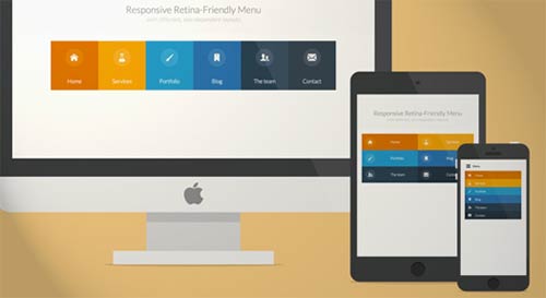
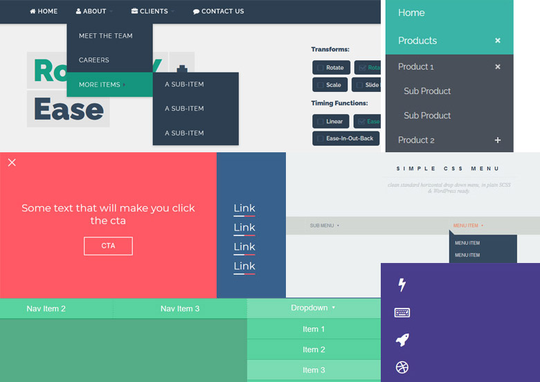
Looking for an easy way to improve your website’s navigation? Check out our free responsive navigation menu! This menu is design to be responsive on all devices, so your visitors can always find what they’re looking for, no matter how they’re accessing your site. Plus, it’s easy to install and customize, so you can get it just right for your website. So why wait? Give your visitors the best navigation experience possible with our free responsive navigation menu!
Free Responsive Navigation Menu
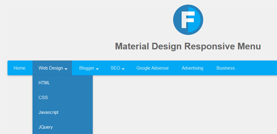
Material Design Responsive Menu
The trigger and the pop-up menu are the two components that make up the menu component of Material. These two parts are connected to one another in some way. The menu trigger is a regular button element that has additional attributes add to it in order to establish a connection to the pop-up panel. These additional attributes include aria-haspopup, aria-expanded, and aria-controls, among others.
Responsive and Mega menu
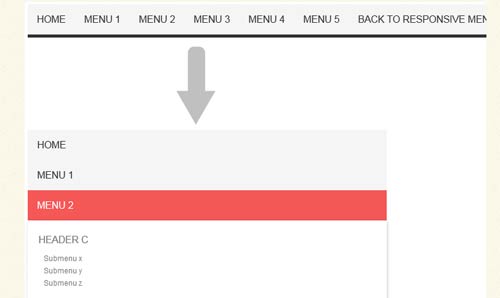
A responsive mega menu is a large-scale dropdown navigation menu that use to display a very large number of a website’s internal page links. This type of menu is design to be mobile-friendly.
It is not the same as the submenu or dropdown menu that is include with the default installation of WordPress. The navigation area of your website can adorned with a wide variety of cutting-edge features, such as icons, images, and even more content, when you use a mega menu.
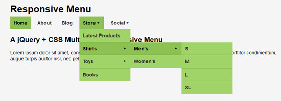
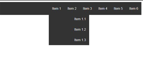
CSS Multi-level Responsive Menu
The procedure of displaying a multilayer dropdown menu utilizing simply CSS and HTML is one that is really easy and uncomplicated to carry out. In a previous walkthrough, it explained how to use jQuery to construct a dropdown menu that just had one level.
Because in this article it will be developing a multi-level menu without utilizing jQuery or any Javascript, you will not need to download any of those tools.
CSS3 Responsive menu effect
Because I’m in the mood to tinker about with CSS3 right now, I thought I’d use today’s article to show you how to develop some one-of-a-kind hover effects for menus.
It is intended that there will be a simple composition of components, which will consist of an icon, a main title, and a secondary title, and that these elements will be animated using just the transitions and animations that are available in CSS whenever the mouse is moved over them.
We are going to do research on a wide range of diverse impacts that the components of the system may have.
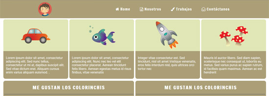
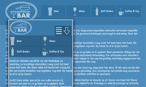
Responsive menu with logo
Responsive menu with CSS Regions
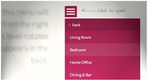
Overflow menu items into a side-menu when it don’t fit the viewport.
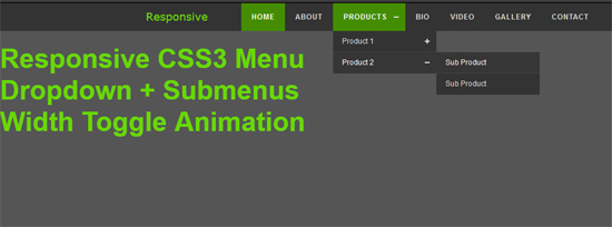
CSS3 Responsive Menu Dropdown + Submenu width Logo
Responsive menu with sub-menu
Responsive Menu Using Trunk.js
flexbox layout – responsive menu
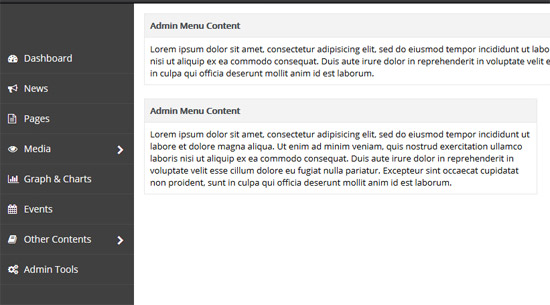
Responsive Admin Menu
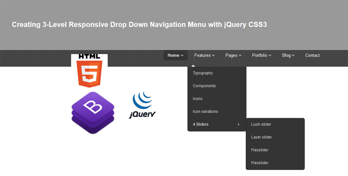
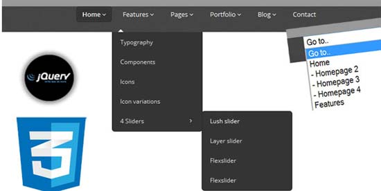
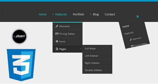
3-Level Responsive Drop Down Navigation Menu with jQuery CSS3
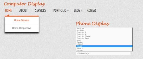
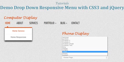
Drop Down Responsive Menu with CSS3 and jQuery
Responsive Drop Down Menu jQuery CSS3 Using Icon Symbol
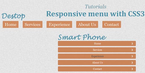
Responsive Menu with CSS3 Tutorial
Drop Down Responsive Menu with CSS3 and jQuery
CSS3 Responsive Menu with Icon
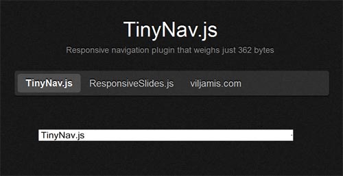
TinyNav Responsive Navigation Menu
HorizontalNav
HorizontalNav is a jQuery plugin that spans a horizontal navigation to fit the full width of it’s container. If you’ve ever had to create this effect on a project, you’ll know it’s pretty annoying to do. But this plugin makes it easy and adds support for IE7.

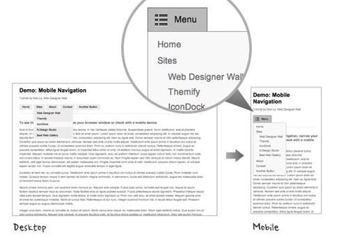
Mobile Navigation Design
A Simple, Responsive, Mobile First Navigation
Big Menus, Small Screens: Responsive
Responsive Select Menu Plugin











best and most informative post!!! I really needed this information
Great themes available.
Truly say I need Material Design Responsive Menu & Thank you so Much for Giving us a beautiful Responsive Navigation Menu Article that I am Looking for.
This is awesome tutorial
Landing Page Design 2021
good work
Thankyou So So Much For Menu. Good Luck
thanks for sharing these Awesome menu
Thank you for sharing this coding because it really helps and gives me an idea. Thumbs up!
best site of codes
it’s very nice site man, thanks for providing diff. kind of responsive menus.
now in these days it’s fashion to have resposive web site.